Unless you’re a website designer, you probably don’t spend much time comparing design features on different websites? However, everyone can ‘feel it’ when they have landed on high quality website design.
What makes a good website design that really works?
Design is subjective, there’s always colours and styles you do or don’t like. BUT, there are 8 absolutely critical design elements that a website must get right in order to convert cold website traffic in to customers.
1. Consistency
Your website, printed materials, shop fit out, social media…. ANYWHERE that your customers engage with your brand must stay consistent. It says “I’m a professional and provide a high quality product/service.” Inconsistency on the other hand says “I’ve slapped this together on the weekend, with a mish-mash of free stuff from Google…”
Consistency applies to everything and is arguably the most important design principle;
- Image type, eg consistently using the same style of illustrations or photos
- Image style, eg using the same filters on all photos, paying attention to lighting
- Font types, using the same fonts for all headings, matching it to your logo & across all print materials
- Colours, choosing a set of specific colours to use across all your branding (record the hex codes for future reference)
- Copy; keeping your messages similar in tone and style, eg casual/conversational versus expert/authoritative.
2. Usability
The big takeaway with usability is also CONSISTENCY. Your website navigation must appear in the same place on every page of your website. If your website is difficult to navigate and visitors cannot quickly access the information they are looking for, then they’ll leave.
- 99% of websites use the classic menu bar across the top of the website page – because that is consistent with what browsers expect.
- Your navigation menus should be as simple and direct to the point as you can. Try to reduce the number of choices your visitors have down to just a handful of options.
- Usability also extends to the colour and font choices. You need to ensure that your visitors can easily read the content of your website. For example, writing chunky paragraphs in neon yellow on a white background or in a really curly font thats hard to read, is obviously a bad idea.
- How fast your website loads is also a key ingredient to usability. If your website is clunky and takes too long to load, your visitors will hit the dreaded back button and disappear forever.
3. Optimised for mobile & tablet
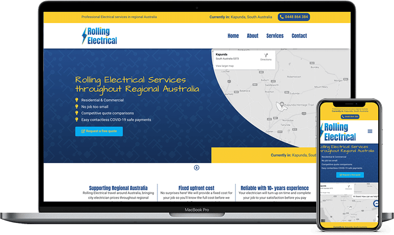
This means making sure that your website is not just accessible from a mobile or tablet device, but is actually optimised for it. Visitors need to be able to easily read all content without scrolling left to right (yuck), the font type/style must be a good size for small screens and images need to be optimised to fit as well.
4. Original/unique images
While it might be tempting to go a pull some images from Google or a stock image website, that is not going to win over your customers. I can tell within 2 seconds of landing on a website what imagery is original content and what is stock photos. I’m sure you can too, and so can your customers. Stock images are not always bad, in fact I use them frequently in places like this blog! However, images on my primary landing pages are always unique to us and consistent with our brand.
- If using stock images, make them ALL THE SAME STYLE (again with that consistency word!). Choose an illustration style and stick with it.
- with photos, try and use the same lighting (ideally natural day time!) and filters. If photographing your work space, double check anything that appears in the frame – overflowing rubbish bins, half-eaten plates of food, inappropriate desktop backgrounds etc.
- Even if your workplace is your home, or does not have all the bells and whistles, using original photos of your work in progress/behind the scenes is powerful. It provides visual proof that you are genuinely doing the work yourself, and not just acting as a middle man. Since the world is full of skeptics, this could provide the last push to get them to enquire or make a purchase.
- Finally, consider the opportunity in spending the time to get original images. If its a bit of an inconvenient pain for you, it is also a pain for your competition.
5. Clear/concise copywriting
There is a reason why professional copywriters get paid so well. Copywriting for web is a multi-faceted task, writing firstly for your customers, secondly for your brand and thirdly to appeal to search engines. But the basics are simple
- Write as if your visitor is a year 9-10 student, but not like you’re preparing an essay.
- Conversational messages always work best, even if you’re attempting to explain something complicated. If you write too formally, it can be dry, boring and drive them away.
- Try to provide as much value as you can, as concisely as you can. Just like you reading this post right now, your customers are overwhelmed by the huge volume of ads in SHOUTY CAPITALS screaming at them. Make your stuff stand out and give them real answers, no fluff. Dot points are great!
- Avoid using too much complex, technical industry jargon & terminology, simplify terms wherever possible.
6. One, obvious CTA for each page
Give every page of your website a ‘goal’. whether that is signing up to an email list, making a purchase, downloading a free resource, scheduling a call or sending an enquiry. This is called your CTA (or Call To Action) and is something that a lot of websites are getting wrong.
- Only one CTA per page. For example, if you write a page about your service with the goal of setting up a free call, don’t add buttons to view your blog posts! Your customers will get distracted, read the blog and then potentially leave your website.
- Make it BIG. A big button with BIG text that stands out and makes it really freakin obvious what you want them to do.
7. Negative space
Something we see going terribly wrong all the time is a lack of negative space on websites. What you DON’T publish is almost more important than what you do. Negative space is the breathing room between items on your page, and vitally important for visitors to see distinct areas of your site. It makes your CTA stand apart from the rest of your content. Use it!
8. The small stuff
Attention to detail is something that the average ‘rust bucket’ freelance website designer will not provide (or the pushbike DIY builder for that matter). This is one of the key areas that makes a good website design.
- Little design elements, like your favicon, button styling
- Making it easy for customers to contact you – adding a live chat widget, social proof with 3rd party reviews
- Making sure that there are no display issues on different screen sizes, at a minimum testing on one desktop, tablet and mobile phone.
- Use fonts that are ‘web safe’ so that older browsers still display correctly
- Removing ‘default’ content like ‘Hello World’ WordPress posts, and avoiding using branded plugins wherever possible.